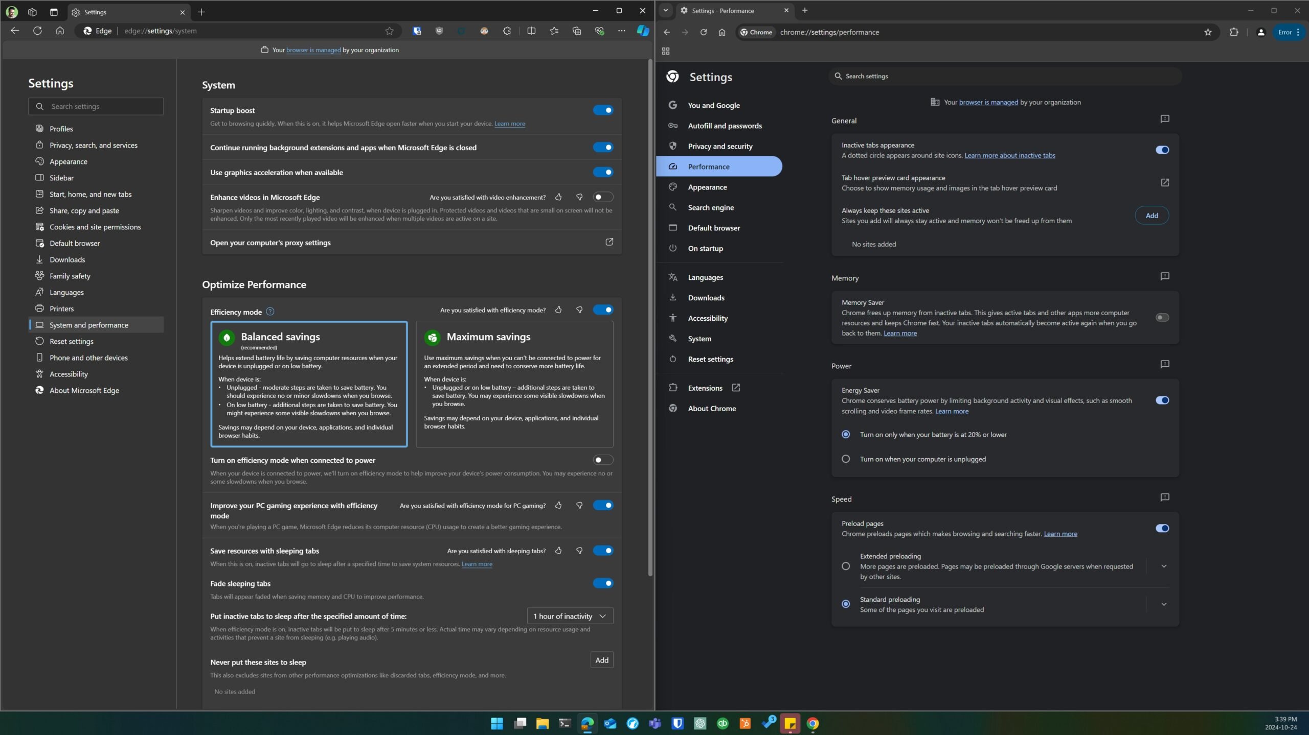
Great news, Edge enjoyers! Microsoft is streamlining the Edge Settings page.
This update is a direct response to the increasingly arcane layout of Edge, which when compared to the simplicity of Google Chrome has left some users feeling frustrated. With this redesign, Microsoft plans to offer a more intuitive interface akin to Chrome, aiming to enhance user experience by streamlining navigation and reducing clutter.
Simplified Navigation for a Better User Experience
Quick Access – The first significant improvement is the introduction of quick access suggestions, where Edge will provide shortcuts to frequently used settings directly from the main settings page. This change reduces the number of clicks required to access key features, making customization easier for both casual users and power users.
Better Layout – The second change focuses on streamlining pages with multiple options. Users will no longer have to scroll through lengthy lists of settings to find what they need. This makes navigating complex sections faster and more efficient.
Collapsible Subsections – Last but not least, Microsoft plans to segment long settings pages into smaller, expandable subsections, decluttering the interface and allow users to view only the settings they need.
Bad to the Chrome
When comparing the two browsers, even as an Edge user I have to admit Chrome’s settings page stands out. While it lacks quick access suggestions like Edge, the layout in Chrome is easier to navigate. With these new updates, Microsoft appears poised to give Google a run for their browser share, or so the eggheads at Redmond hope.

I want it now!
Slow down there, big rig! The new update is expected to begin rolling out at the end of the month. However, it may take a little time before it reaches the stable version of Microsoft Edge, meaning you might not see it right away. However, any change in terms of better UI is a welcome one, and I suspect a few curious Chrome users may opt to try for the Microsoft-flavored alternative, especially if they’re fed up with the direction Google’s been going in.
Bonus Update #1: Slimming down the Sidebar
In addition to the settings overhaul, Microsoft is also addressing another area of frustration: the sidebar. Currently, Edge’s sidebar is cluttered with a host of app icons, many of which never see a single click. Soon Edge will automatically suggest removing these icons, making the interface cleaner and easier to navigate.
In my humble techie opinion this new feature is a much-needed improvement, especially for those of us who value a clean workspace (unlike my partner, whose desk is currently piled up with used coffee cups).
Bonus Update #2: Better battery life while browsing
The final exciting development as of this writing is the potential synchronization between Microsoft Edge and Windows 11’s Energy Saver mode. Currently these settings operate independently, but once integrated, could provide more efficient power management while browsing. This is especially beneficial for those of us on the go, as battery life could be extended without sacrificing performance.
Final Thoughts
We all know Redmond wants a bigger piece of the Browser marketshare pie. Will these updates be enough to sway Chrome users? We’ll see. Either way, they’re a step in the right direction.
While Google Chrome has long been the market leader, Microsoft’s commitment to enhancing Edge’s usability—paired with its powerful features like enhanced security and AI integration—positions it as a strong contender. The user-friendly navigation, paired with performance optimizations, could make Edge a more appealing option for those who are tired of of Google’s grip.


